Skills and Tools:
1. Competitive and Comparative Research
2. User Interview
3. Client Interview
4. Affinity Diagram
5. Flow Chart, Persona, Journey Map
6. Low & High Fidelity Wireframe
7. Usability Testing
Overview
Our client JobVibe want to improve user's comment quality and develop a function that is beneficial to managerial users in order to improve the overall app quality and value to customers.
Team & Duration
2 designers
2.5 weeks
The Project Brief
Our client JobVibe is an application that aim to improve their customers’ team performance by monitoring team morale and identify issues within the team.
JobVibe currently use weekly model to gather team members’ morale rating on every Friday, ask them about the “factors” that went well or require improvement in the last week, and ask them to provide comments then show through “Fix” (issues) and “Buzz” (appreciations) page on the app. All comments, based on users’ choice, will show on the “Fix” and “Buzz” page with identity. Then the data will be on a dashboard on web application available to all team members, and the aim is to let manager use the information on dashboard, see the morale trends and review the “Fix” and “Buzz” comments, react to the issues to help improving team performance.
Customer's Request
Known from project brief, customer want to sell their services to target buyers who have team members number from 100 - 500 people, refer to that need, they want to develop the application to be more useful for managerial users to see the insights and trends from the information provided, especially on the “Fix” (issues) page. Moreover, after further discussion about their current application performance, we found out the reason behind improving the “Fix” page is that the current application is gathering useless information for the team leaders, and the JobVibe team is working on some UI design to make the experience better at the same time.
So, after the customer meeting, we aimed on two objectives on this project:
1. Improve the team members’ comment quality
2. A longer-term system that can let managerial users make use of the information provided by team members.
Our Assumptions
We believe that an employee engagement and communication tool is only a platform for team communication, the motivation for employees to comment in quality way is not only affected by the UI design of the application, but to create an experience for users that it is attractive enough to leave comments on the platform. We need to find out how employees can be motivated to comment on negative issue in their team that help to improve performance.
Our assumption is that employees who are more engaged to their team are more willing to comment on issue that affect team performance, therefore, assuming that we could find out the initiatives that could increase employee engagement, and apply those insights on the application, at the same time consider the way managerial users could use those information effectively, then we would be able to accomplish both objectives on our design.
Research Approach and Objective
1. Current application evaluation: Learn the current application experience, define the problem area that related or unrelated to the problem we want to solve.
2. Market competitor analysis: Understanding the differences between JobVibe and other main competitors, define JobVibe’s market positioning.
3. Current user feedback: To understand current user comments on the application.
4. Interviews: Learn about employee engagement and team communication from team leader and team member aspect, research audience - 1 Team Leader, 1 Team member
Research Insights
Language - JobVibe Style - Employee motivation
We synthesise the research result and learn three major insights that can improve the application design.
Language - from application evaluation and current user feedback we found that the language used in the application is not human-centered, for example, the application uses “Fix” and “Buzz” as the conversation categories and even ask user to post “Fix” when they want to give comment to that comment type, feedback from current users said that they are confused with the information they have to put into this comment, so one of our mission in design improvement will be clarifying the ideas to users.
Style - When comparing JobVibe with other competitor such as 15Five and Tinypulse, we found that in order to keep full transparency in JobVibe, there are no attractive ways to ask for comments. For example, other application with anonymous feedback system and private message system could encourage users to comment without consequence. Therefore, it is crucial to invent a way to generating useful information from JobVibe users in full transparent environment.
Employee motivation - From current user feedback and interviews, we discovered some indicators of how an employee is shown engaged, e.g., employee fill in non-compulsory survey. Furthermore, we revealed factors that could increase employees’ engagement to the team and motivation to give feedback. e.g., a safe environment to talk, employee want to proof their time are used effectively and people want to know their comment are useful and being used to influence the upcoming changes.
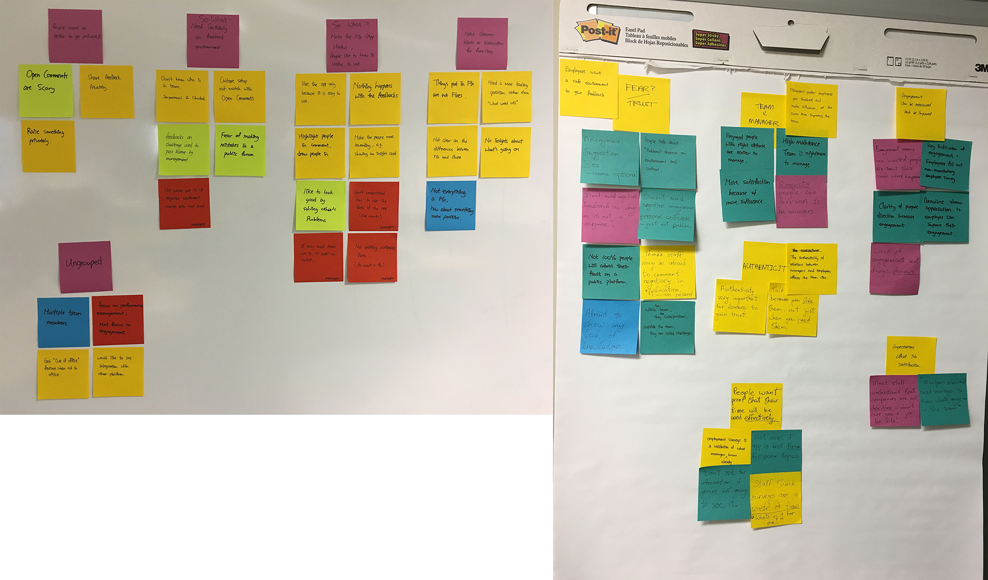
Pic 1: Affinity diagram of comments from existing feedbacks (left) and interviews (right)
Needs prioritised design
Further developing the design, although there are many needs we have to fulfil, but we set our ground on prioritising needs on our design:
Demonstrate effectiveness for users, so they will know they are influencing the team.
An issue-management framework for management and staff
Get more meaningful information by providing a safe space
Keep the app simple and easy to use which match the JobVibe style.
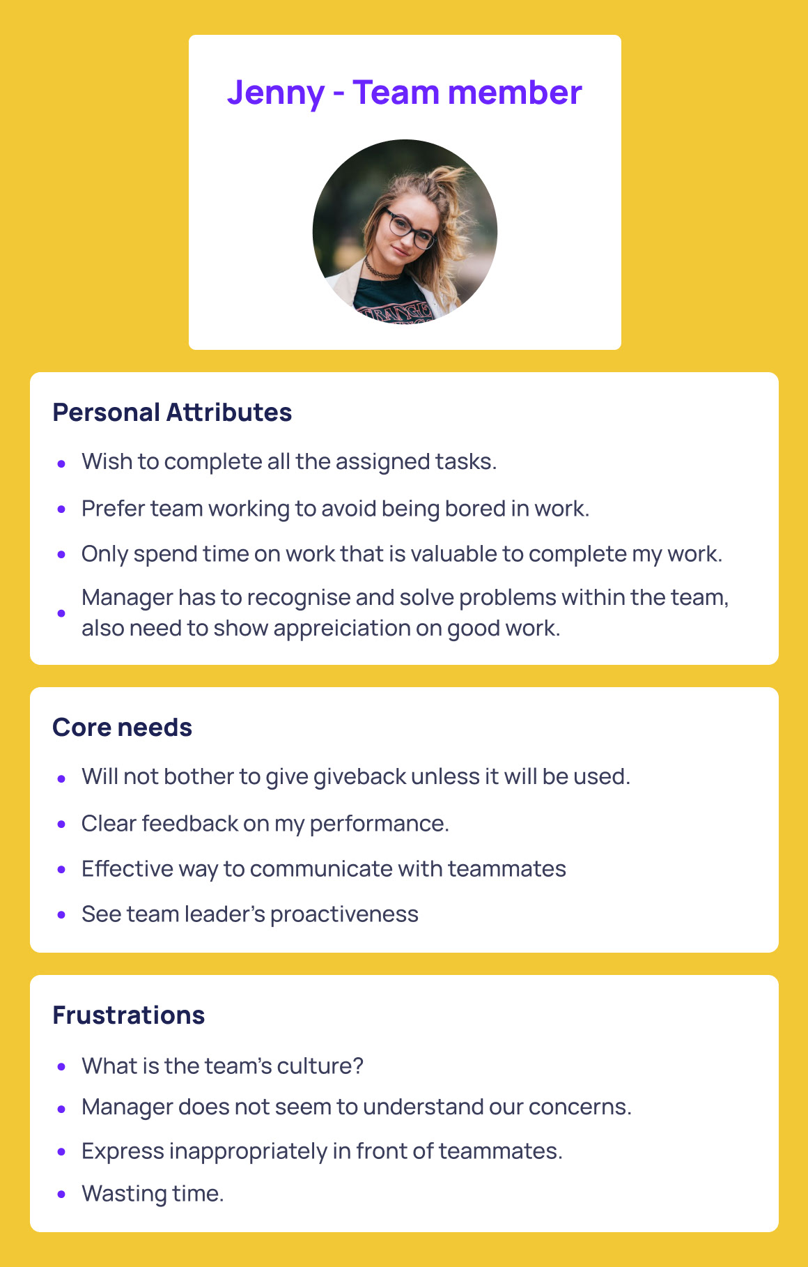
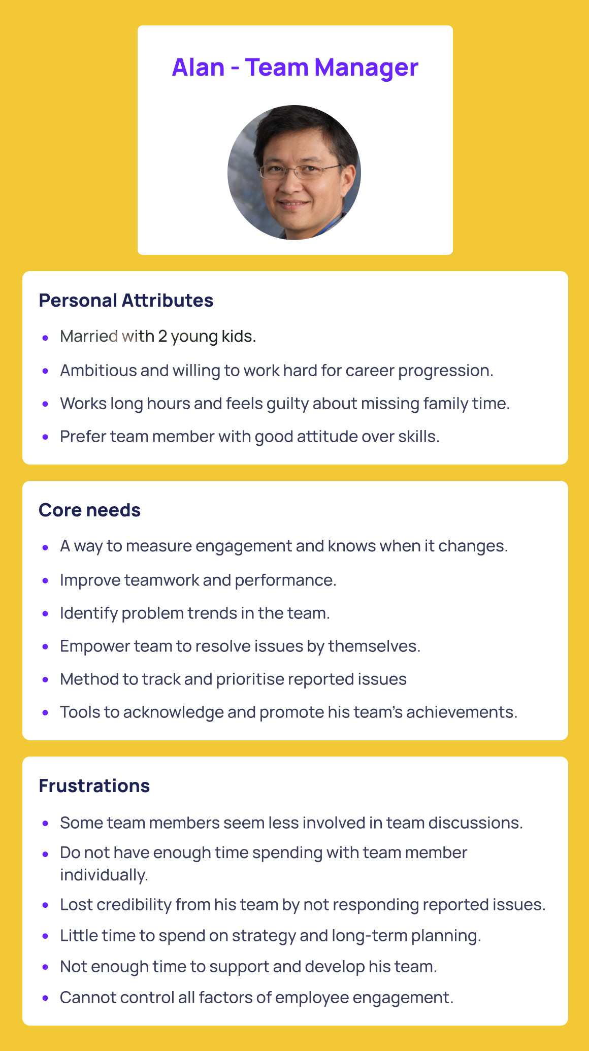
Personas
Personas are conducted based on our understanding and prioritised design can fulfil core needs and concerns of main user group.
Design
Ideation 1
We managed to create a new design complying the insights, which have a new impact level system to gather employee’s opinions on each topic that everybody has in the team, and managers can use those total impact level to recognise the most important issue and solve them. In this design, we applied the most simplified way to fulfil all the design need to solve the problems about employee engagement and also the requirement from customer.
After we show the hand-sketch of the idea on the new design, we had been told by client that they do not have the resources to launch a redesign and they would love to keep their original design in the coming future, and they narrow down the requirement of the project and ask us to work on the “Fix” page flow for managerial use only.
Ideation 2
Even though the requirement had been narrowed down, but we communicate with client that we shall keep the design concept of increase employee engagement and the design needs we had when we design the “Fix” page for them, if not, the whole project will be only a design for managerial users and not getting to the point of collecting useful comments from team members.
So we started to work on iterating the deign of the current app that could fulfil both the business need and thereal user needs, and leverage the application’s influence on employee engagement.
Results
We redesigned a new flow for current “Fix” page, and suggested them to use a more clear language, so we used “Issues” to replace the “Fix” page, and the below are the new pages we suggest JobVibe to add based on the design needs we proposed.
Usability testing: 3 people
Prototype: https://invis.io/388KBHLGR
*partly clickable prototype
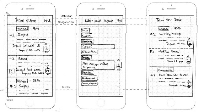
Below are the core design add on JobVibe’s current application (Mobile only): System map of Issue screens:
Relate “Factor” to comment
This suggestion is given to make a change on current Issue page, currently they are using a feed style like Facebook to show all the topics with everything words that people put in it. We suggest them to change the layoutwith factors related to the topics, and the change start from where users choose to talk about an issues. Therefore, users can see all the issues at a glance and quickly access to the type of the issues.
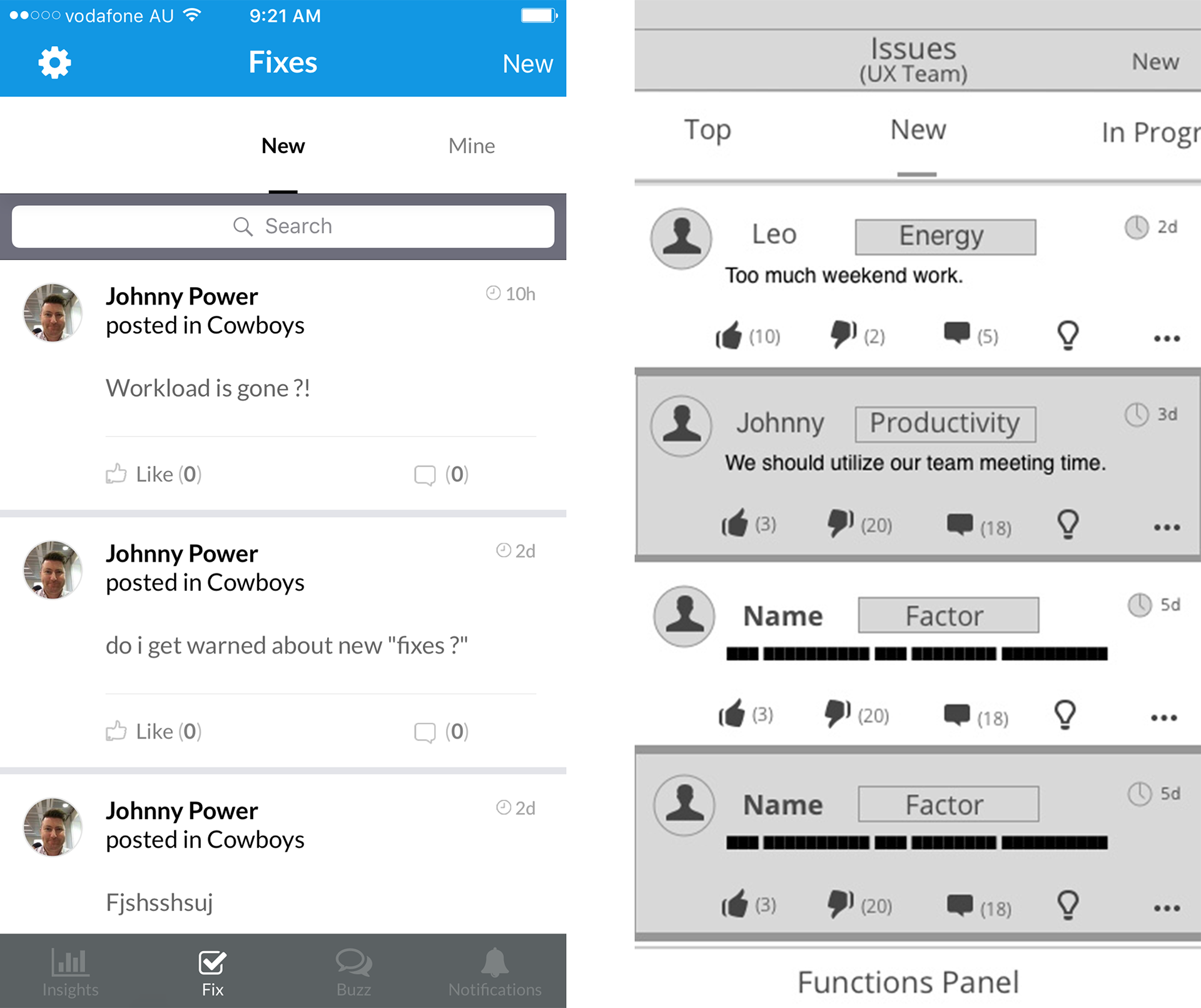
The Issues page layout evolve (from left screen to right screen), and adding the issue type and use short topic, so users can access the information at a glance.
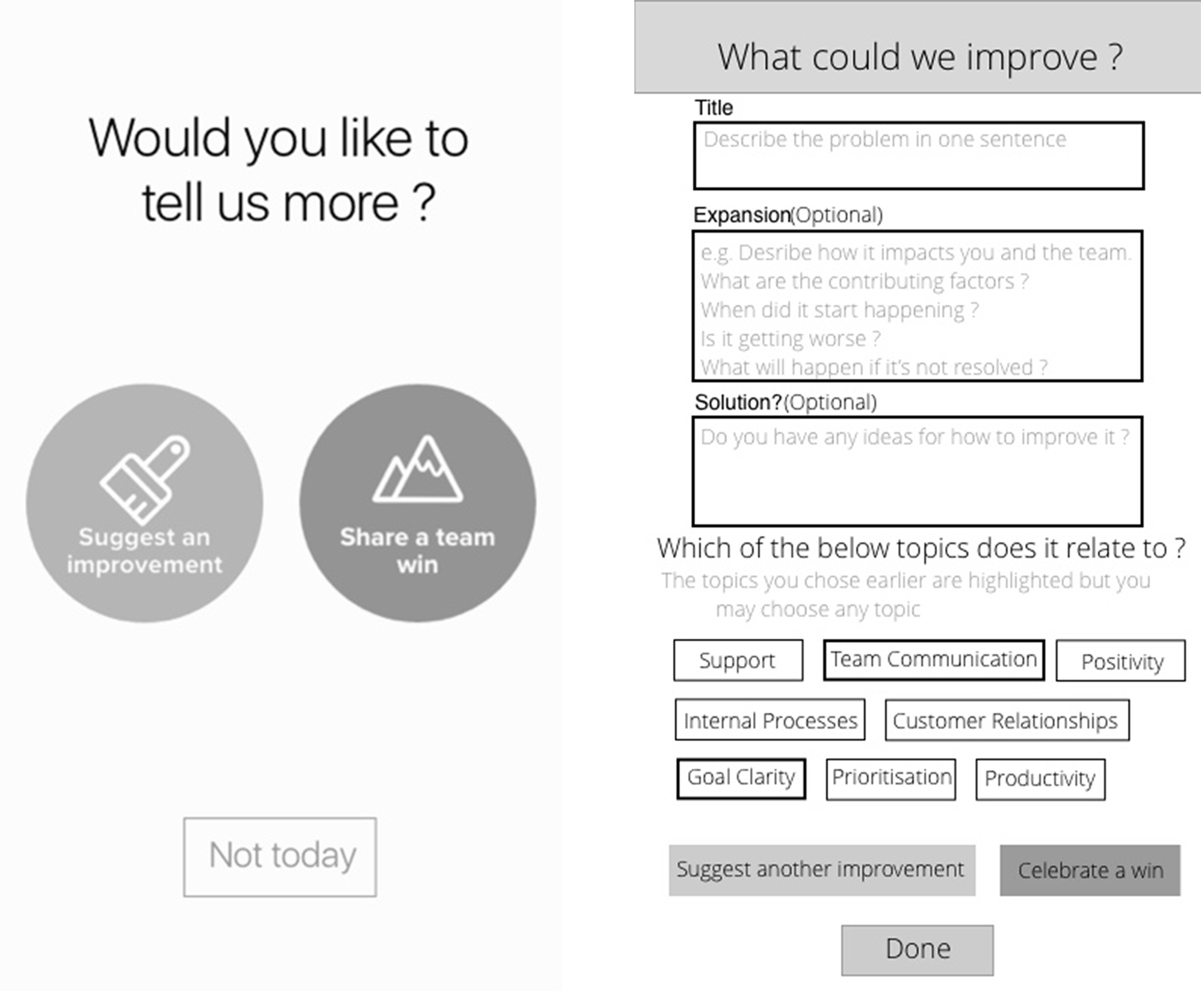
There are two situations that users can post an issue, first one is after they input the weekly vibe, question will popup (left screen) to request for details, then input page will comes up (right screen).
About the input page, users will input topic in compulsory, and details are optional, in order to fulfil different level of user engagement on providing information. Also, when they provide details, they need to pick one “Factor” related to the information they give.
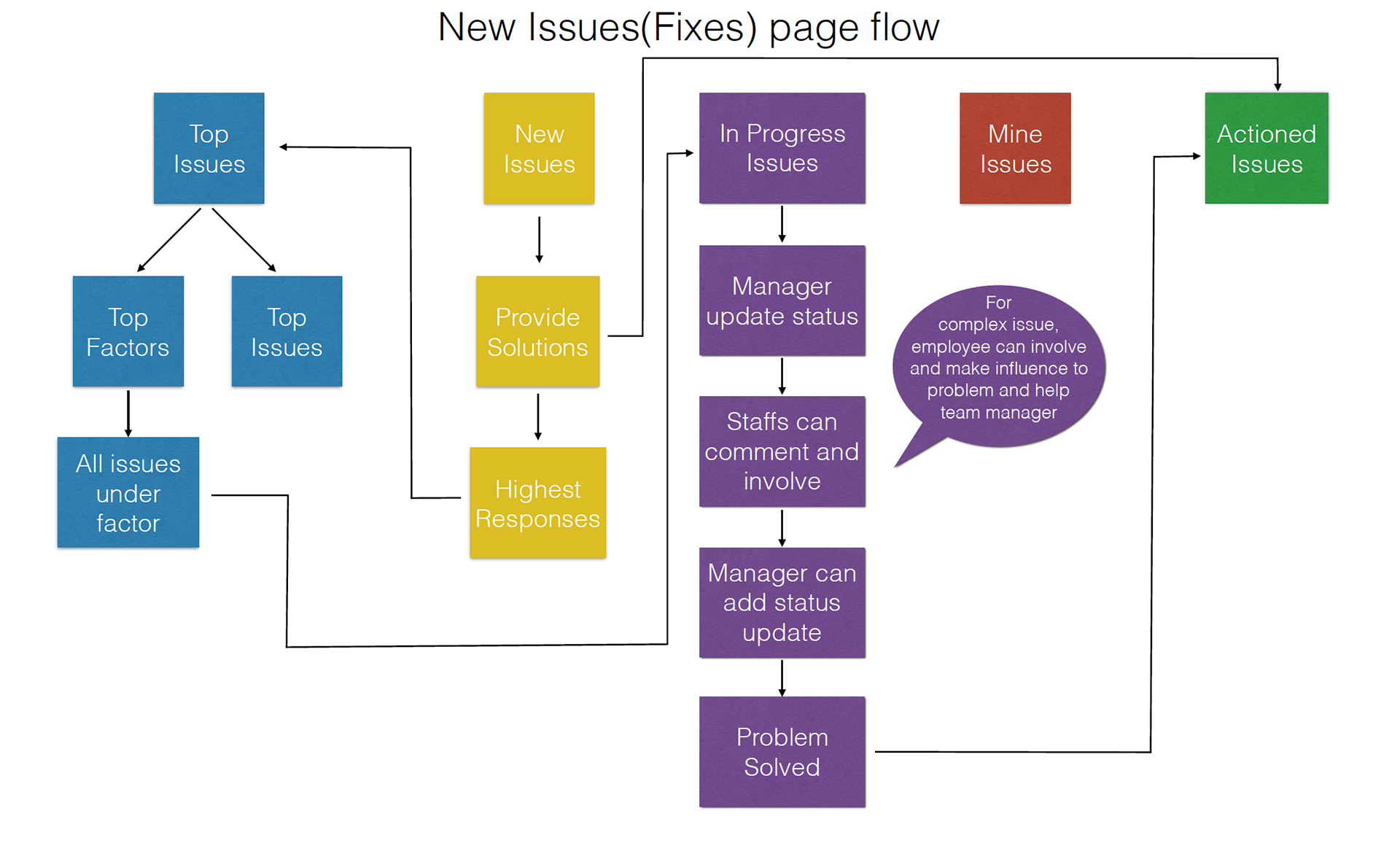
Top “Factors” / Top Issues
A new category “Top” is suggested to add to the panel under issues, and two sorting method provided in top“Factors” or top Issues, users can see the highest responded post base on the “factors” chosen by all team members or the issues themselves.
This design support the need of managerial users to know what are the hot issues they could solve it first, at the same letting team members influence the whole progress even they only input their weekly vibe by choosing the “factors”, their selection also reflect on the “Top Factors” sorting.
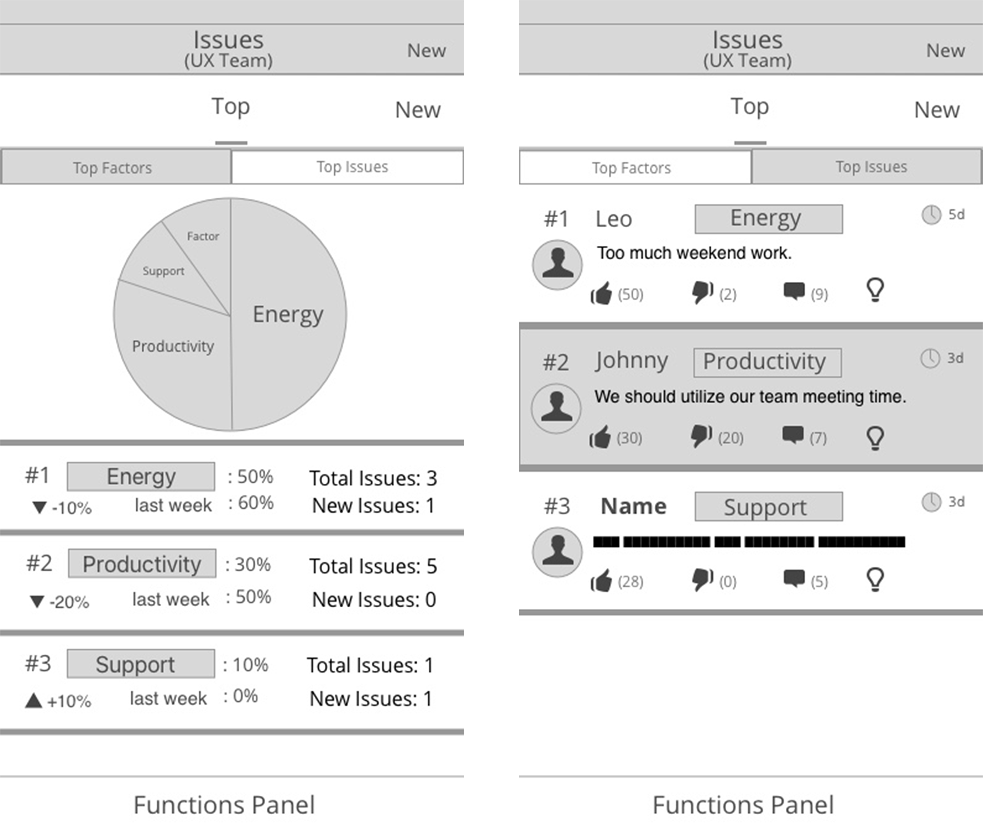
Top” post divide into two sorting methods: “Top Factors” & “Top Issues”.
In “Top Factors”, people can click into the “Factor” and see all the issues of that “Factor”.
In “Top Issues”, the issues are arranged by the most response rate, and it could be counted by the most agreed, or the most commented.
In Progress Function
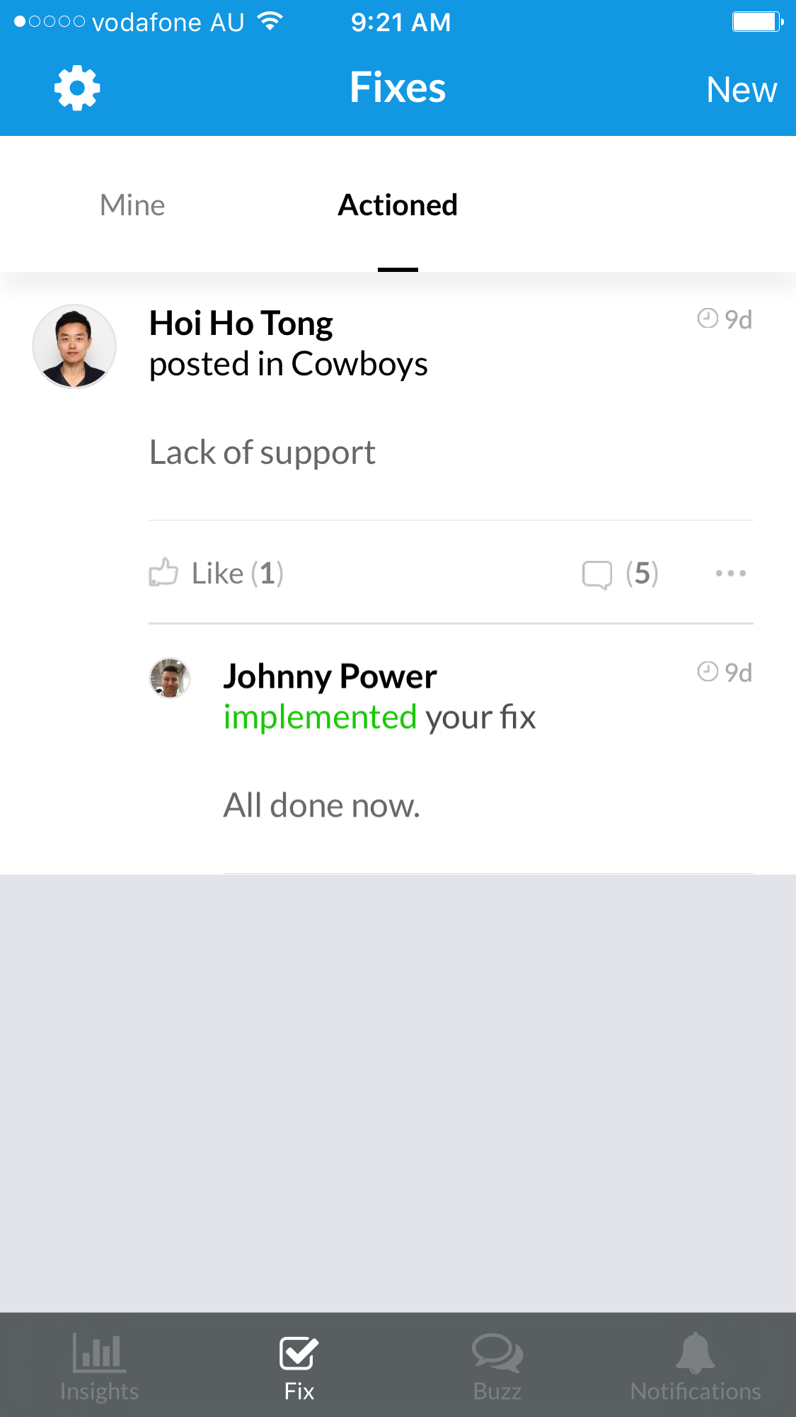
A new category “In Progress” is suggested to add into the panel, in current version, every issues responded byTeam leader will directly send to “Actioned” page, and new status update will replace the old one, they are no tracking for the issues and status for team members.
The new “In Progress” screen are added to give team members to join in the conversation, track and provide opinions on team leader’s status update.
Current "Actioned" page
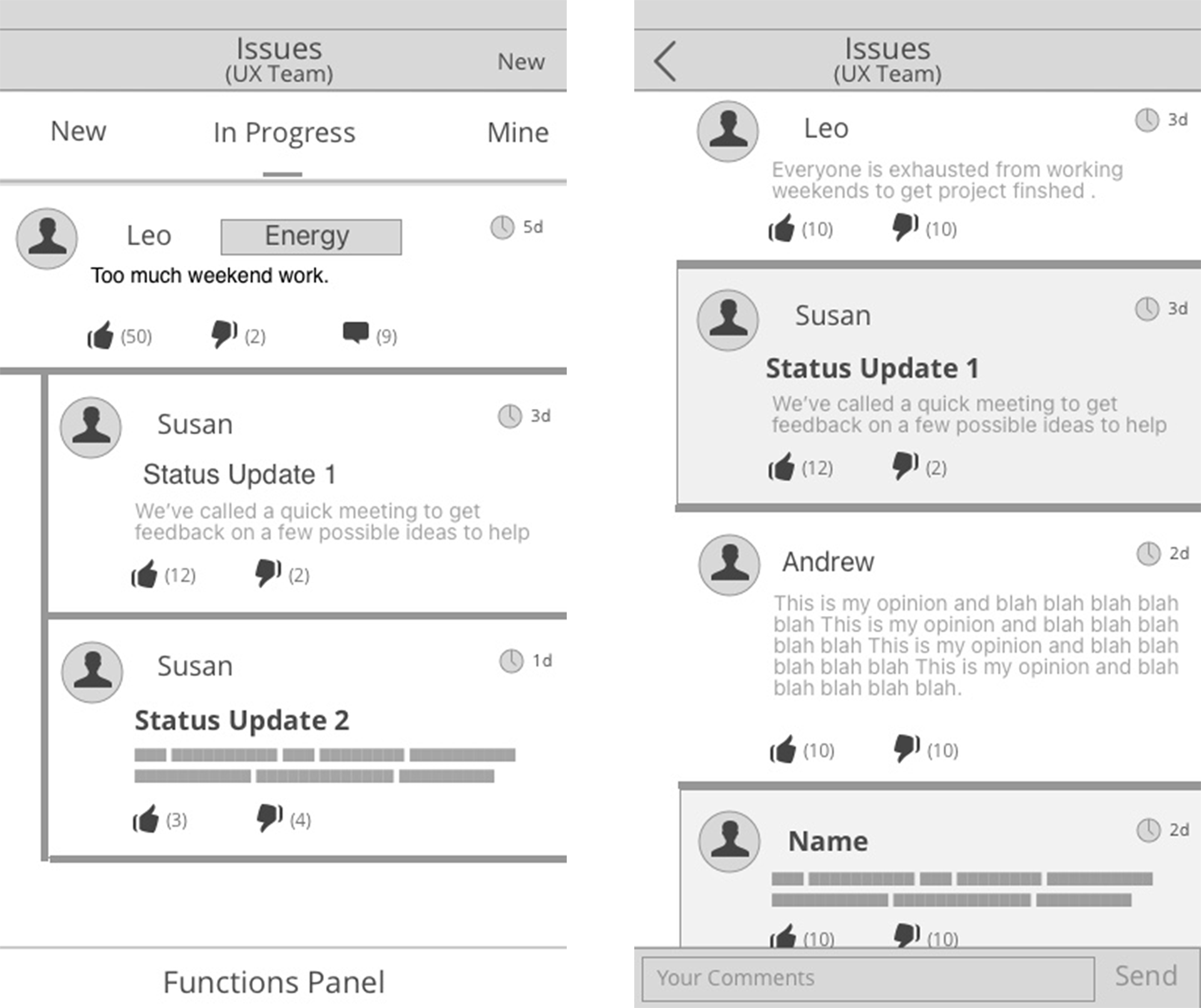
In Progress page will provide all status update information, and put status update into the comments so users can track the message before and after the status update.
Dashboard
It is suggested to put on the current insight page, with two versions of team leaders and team members, the information shown on the screen will be different, and it needs to be decided by research on what kind of information would users matter. The use of dashboard is powerful as it users can look at the trends and team performance here and trigger users to further engage in the app.
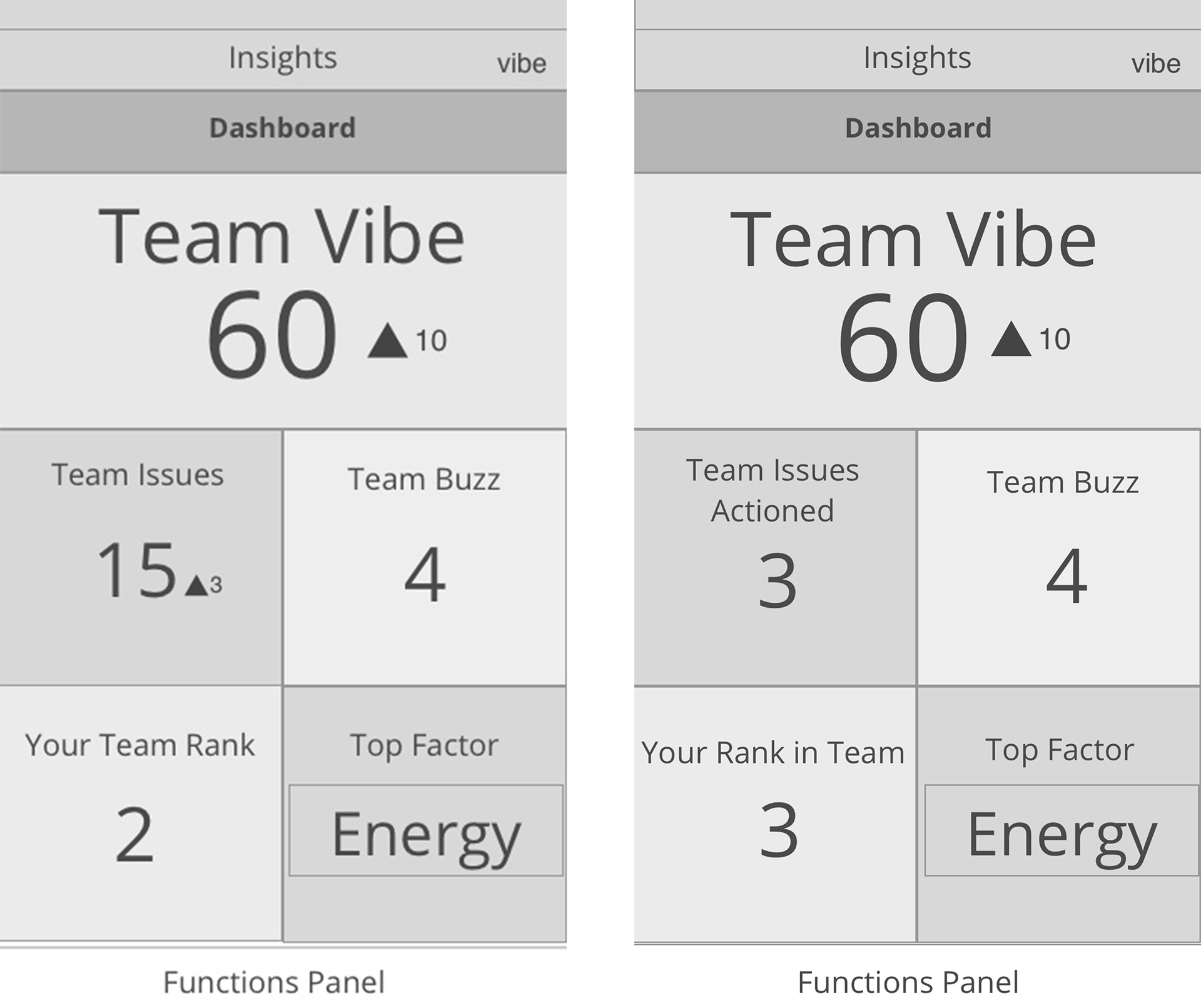
Screen on left is an example of team leader and team member on right. information provided is different, base on users’ interest.
Information provided can be fluid, and pressing squares in this screen can forward to the screens related to the information.
Suggestions for future development
Besides the design on the application screens, our team also provide some suggestions on their current app that can improve the experience and further reach business and use
1. Design of “Factor” need to improve, to be more people-related, so team member can empathise on the “Factor” they pick, so they could be familiar with them and share more on issues related to them, not only use business or team related topics that team member does not understand.
2. Gamification - Can be an evolvement of the dashboard function that motivates team member to engage on the application.
3. Appreciation - Solving issues are important, but appreciation is also vital to team members. From the concept of new issues screens layout, similar idea on “Buzz” will be a useful tool.
4. Poll - “Factor” has been one of the polling system provided for issues arrangement to get users involve, we foresee that if the application want to be focus on solving team issues and improve performance, so, a poll system for decision making could be useful.
End of Case Study - JobVibe - Mobile App Improvement Project